What Churches Should Know about Web Accessibility and Why it Matters
- Sara Swenson
- Mar 5
- 5 min read

Updated: Mar 15
By MI Sara Swenson
Resources: AFB, the AEM Center and Accessibility Test.org
In this blog post you will learn about what web accessibility is, where to start, and practical, easy tips to make your content more accessible. The last part of this blog post includes a list of helpful tools and links, some of which I have been using for years.

What is web accessibility?
Web accessibility is the practice of designing and developing websites and online resources so people with disabilities (including visual, auditory, physical, and cognitive impairments) can equally perceive, understand, navigate, and interact with the web.
Web accessibility may seem like a foreign concept that is difficult to learn. You may be thinking "I don't have time to learn a new thing" or "Does it really matter?". It does matter, and I will walk you through some web accessibility basics and practical advice on how to slowly integrate more accessible web content into your church's website, Facebook page, etc.
Where do I start?

Firstly, I would like to briefly discuss WCAG (The Web Content Accessibility Guidelines). These are guidelines that let people measure how accessible a website and its online content is. Think of it like a grade in school, you can get an AAA, AA or A rating. Most organizations aim for level AA compliance to make sure their website is usable for people with disabilities and to meet legal requirements.
The 4 principles of WCAG are:
From the AEM Center
Perceivable: Information and user interface elements must be presented so users can perceive them. For example: providing alt text for images, ensuring content works with screen readers.
Operable: Interface components and navigation must be operable. For example: keyboard navigation must function and interactive elements must be usable.
Understandable: Information and the operation of the user interface must be understandable. That means clear language, predictable layouts, consistent navigation.
Robust: Content must be robust enough that it can be interpreted reliably by a wide variety of user agents, including assistive technologies. Compatibility across browsers, devices, and platforms is key.
As a Church I should start by...
Color Contrast
A great place to start in your web accessibility journey is making sure your content, particularly your text, meets color contrast standards. Meaning you should use dark text on a light background, and light text on a dark background. For example, you should not use a light-colored text on a white background. It makes it difficult to read, and your post doesn't do much good if it is not readable. This might sound basic, but it is a mistake I often see. You should also consider if your text can be read by people who are color blind, a resource with more information on that is in the last section of this post.

Alternative Text on Images
Another easy but still very important step is to add alternative text on images. Alternative text, also known simply as "alt text", is a short, descriptive phrase embedded in HTML that describes the image's content and function. This may sound high tech, but I promise it is easy to do.
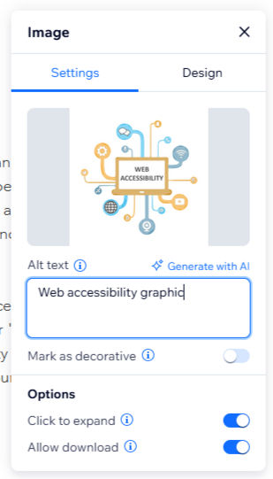
Here is an example on the left of how to add alt text to an image on this webpage. First you select (or click on) the image. Then select "settings". A text box under the heading "Alt text" appears and you simply type a short description on what your image is of. For example, the alt text I added for the image at the top of this article is simply "web accessibility graphic".
Examples of alt text you might use for images at your church may be "church exterior", "baptism of baby Mark", "Ash Wednesday service", etc. It is just a short description of whatever your image is of.
Alt text allows people who are low vision, blind and/or use assistive technologies like screen readers to be able to also enjoy your photos and glean their importance. It is a good practice to get into, especially as many churches are working with aging congregations who will appreciate alternative text. Some websites, such as Facebook will generate alt text for your automatically. Pre-generated alt text isn't always great at describing things. Like most AI, is easy to use, but it doesn't always do as well as an actual person.
Hierarchy and Keyboard Navigation
"Keyboard navigation is an essential aspect of web accessibility, especially for users with motor disabilities. Many individuals rely exclusively on keyboards to interact with digital content, making it crucial to ensure that websites are navigable without the use of a mouse. Testing keyboard navigation involves several important elements that can enhance the user experience for keyboard-only users." (accessibility-test.org)
"Start by assessing the tab order of your website. The tab order refers to the sequence in which elements receive focus as a user navigates through a page using the Tab key. Ensure that the tab order is logical and follows the visual layout of the page. This means that interactive elements such as links, buttons, and form fields should be reached in a predictable and sensible manner. Misaligned tab orders can lead to confusion and disorientation for users." (accessibility-test.org)
This means the key is to make sure your website flows in a logical way. Use headings at the top of your page, use sub-headings to break up content (which makes it more digestible) make buttons noticeable and in a spot that makes sense and lastly put tabs in a logical order.
Helpful website and Tools
Color contrast checker

How do I find out if I have good color contrast? How do I know if my text is the right color?
Use a color contrast checker. This is my favorite one, it's free to use: WebAIM: Contrast Checker
You can check the exact colors your website uses to see if they pass WCAG AA and/or WCAG AAA standards.
Color blindness checker
How do I find out if my website works for people who are color blind?
Use a color blindness simulator tool. This is my favorite one, it is free and you can upload your church's website link and look at specific colors (like your church logo colors).

Scan your whole website to see its accessibility score
You can also use free tools online that check your entire website. The best way to see if your website is truly accessible is to consult an expert, but I understand that is not always possible. Resources like EqualWeb Accessibility Solutions – Full-Service ADA Compliance
are a good place to start. They are free and can give you suggestions on what to work on. After making a few tweaks to my church's website I was able to get an accessibility score of 95%.


Comments